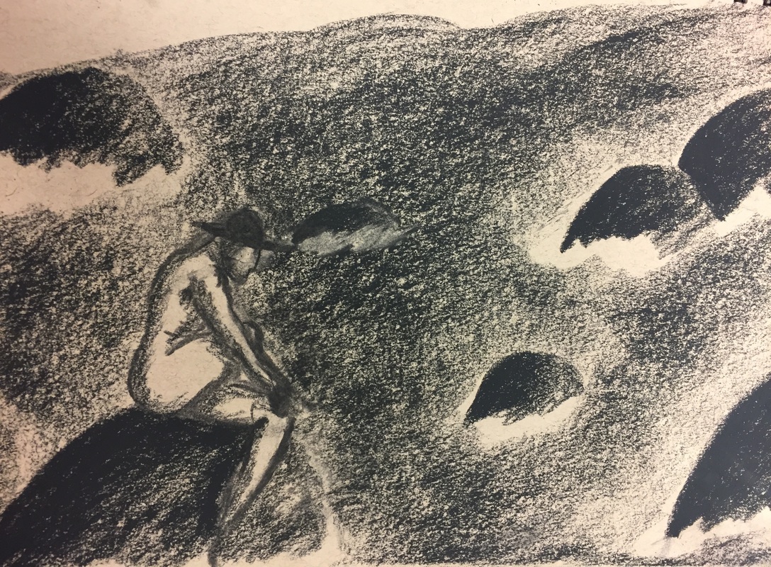
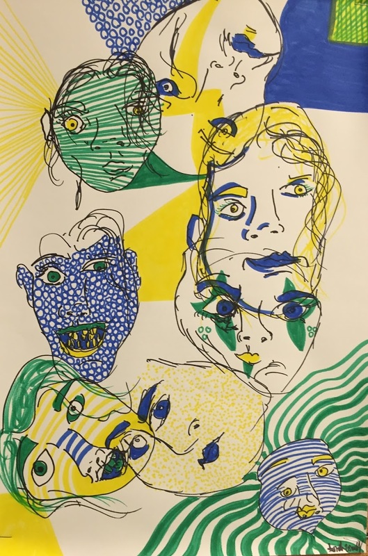
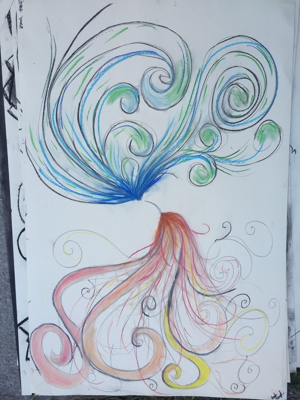
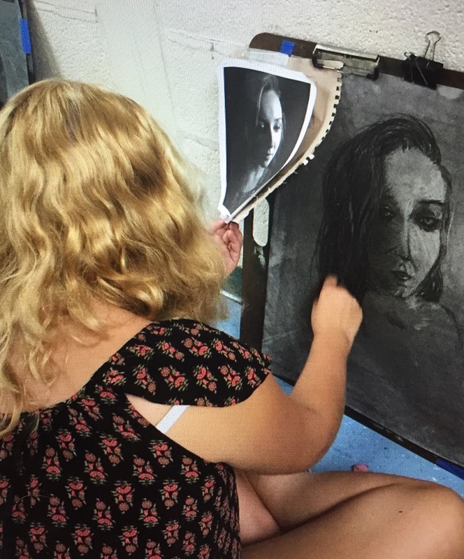
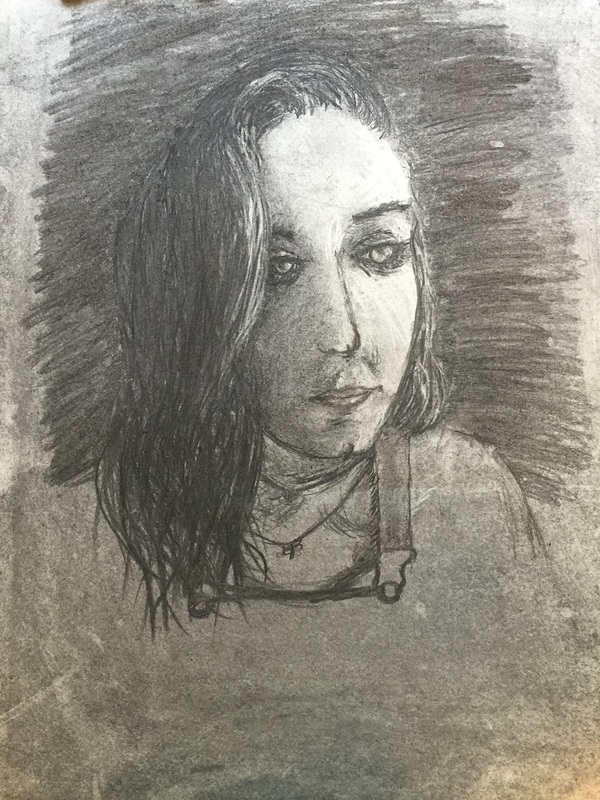
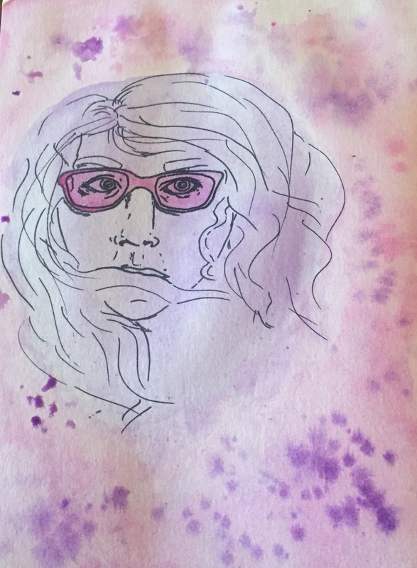
The artist that I copied for this project was Anthony Russo. Anthony Russo is from Tiverton Rhode Island. He does a lot of dark work and tend to use a lot of dark color. The magazine cover is the only time so far that iv'e seen him use charcoal and the two vibrant colors. He seems to use ink and digital medias to do his work. He likes to draw and paint people in nature. He thinks nature is a big part of art. He also liked to portray vivid emotional descriptions. I really liked how his piece didn't have a lot of details yet pulled the viewer in because of the lone person sitting on a rock in the middle of the ocean. His work is very simple but tries to tell a story with few colors and little detail. The simplicity really speaks to me and his work was very cool in my opinion.
0 Comments
The letters project was really challenging to me. Coming up with what words to use or how to portray each letter was really hard. Also we were not supposed to use color which is a problem for me because I love to use color. After a while of trying to do this project people started to stray from the idea of not using colors. That inspired me to color this project like I did. My favorite part of this project is the letter E. E stands for ebony bush, they are very pretty and are the same color as roses, and roses is the word that I used in this project. My least favorite part of this project is the letter O because I didn't really know what to do for it. I finally came to the conclusion of making the letter O stand for oak tree. I wanted all the letters to represent a part of nature.
Learning how to mix paint was the coolest and most beneficial things i've done. Sadly I never did get to finish my color wheel, but I still took away many lessons on how to mix colors. I never knew you didn't have to mix black with colors to make them darker. I think thats actually really cool. Black makes paint brown and icky, and thats also good to know if you need an icky color. I feel like I can tackle paints now with this new skill. I am really happy we did this skill building because I now feel way more confident with my abilities to use certain types of paint and mediums in art.
Coming up with an idea for this project was a hard one. I had to look really deep into my self for the idea I wanted to do. In the future I want to be free from most of my school stress and I want to fly away. So I added wings to the crystal to make it fly away from stress. Also I painted clouds because in the future I wanna keep my head in the clouds and be my self no matter how weird that is. Lastly I added a large blue quartz crystal. Blue quartz symbolizes hope and inspires calmness. I want my future to be hopeful and I wanna keep a calm and cool nature about myself when I face stressful situations. My favorite part of this project was mixing paint and shading the crystal. The hardest part for me was painting the clouds. They kind of look like flowers more than clouds but it was fun to try and tackle this problem.
Oh my this was an interesting project. First we have to draw your selfs, which isn't my strong side, but the catch is we couldn't look at the paper only a mirror image of our selfs. After the terrifying nightmare of drawing myself was over we could color our pictures in with three different colors. I took this opportunity to make my faces look even scarier and more monster like. I really enjoyed the creativity with this project. I really didn't enjoy how the faces don't look like me but I am guessing that was the point of the project. I learned that you can take something bad and turn it into something terrifying.
After watching videos about kinetic drawings in class I was so excited to work on this project with my partner Hannah. Hannah did the cool water like blue side while I did the hot fire like side. This was a really fun cooperative project. Communicating with my partner to make this project taught me a lot. One issue I had with this project was that we didn't have any guidelines. Sometimes I like guidelines and sometimes I don't. I guess that makes my difficult then. What I really liked about this project was we could use different chalk like materials. I really enjoyed this piece and I think it came out really well despite having two people work on one project.
Ive never really used charcoal before and actually had a lot of fun working on this project. At first I thought I was going to have a lot of issues because iv'e never had experience with this material. After watching videos of the Artprof woman I actually understood how to do this and had fun doing it. The hardest part of this project was the nose, mouth and cross hatching. The nose and mouth are usually the hardest things for me to draw or sketch so I knew going into this project I was in for some trouble. In the end I think I tackled the two of these issues well. I really loved having people critique my work half way through the drawing process to show me what I could fix. That was really helpful. The cross hatching was a real big mess, but after watching the ArtProf videos, I think I understand how to do it now. I really like the eyes in this piece and are my favorite part. I really enjoyed this lesson and look forward to work on many more this year.
Its hard for me to draw realistically, and drawing myself is even worse. But since the objective was to create an original piece of art work I enjoyed this project. I was stumped at first but I decided to draw myself as the way I see myself. I drew my crossed eyes, stupid glasses, and messy hair, which always bother me. I also really wanted to do something with water colors since i haven't used them in a while so that was fun. The most challenging part of this project was trying to draw the nose and lips. I think I tackled the nose very well, but the lips were another story. I just used my messy hair to cover up my crazy mouth and it seemed to work out in the end. I really enjoyed the freedom of this project, and look forward to doing more art in the future.
The first images with the two eye balls is in fact showing how one could violate the fair use and copyright laws. This is not legal because the artist didn't take a piece of the artists work, instead they copied the whole art work and changed a small detail. Also the person who copied the work didn't change the meaning of the art, thus this is illegal.
The second image of the dancer is in fact legal. The artist took a small piece of the original work and added new meaning to it. The artist made their own work original and used the work in a totally different way then what the original art work was intended for. The last piece with the donkey is illegal. The artist just copied a picture of the famous donkey Eeyore and changed some of the coloring. The work is still the same except a few different coloring options. The work wasn't really changed in any way, so it is illegal. |
Unknown personalSo dont ask Archives
January 2017
Categories |